
Redesigning an art app, Alpha’a
Identifying the Opportunities
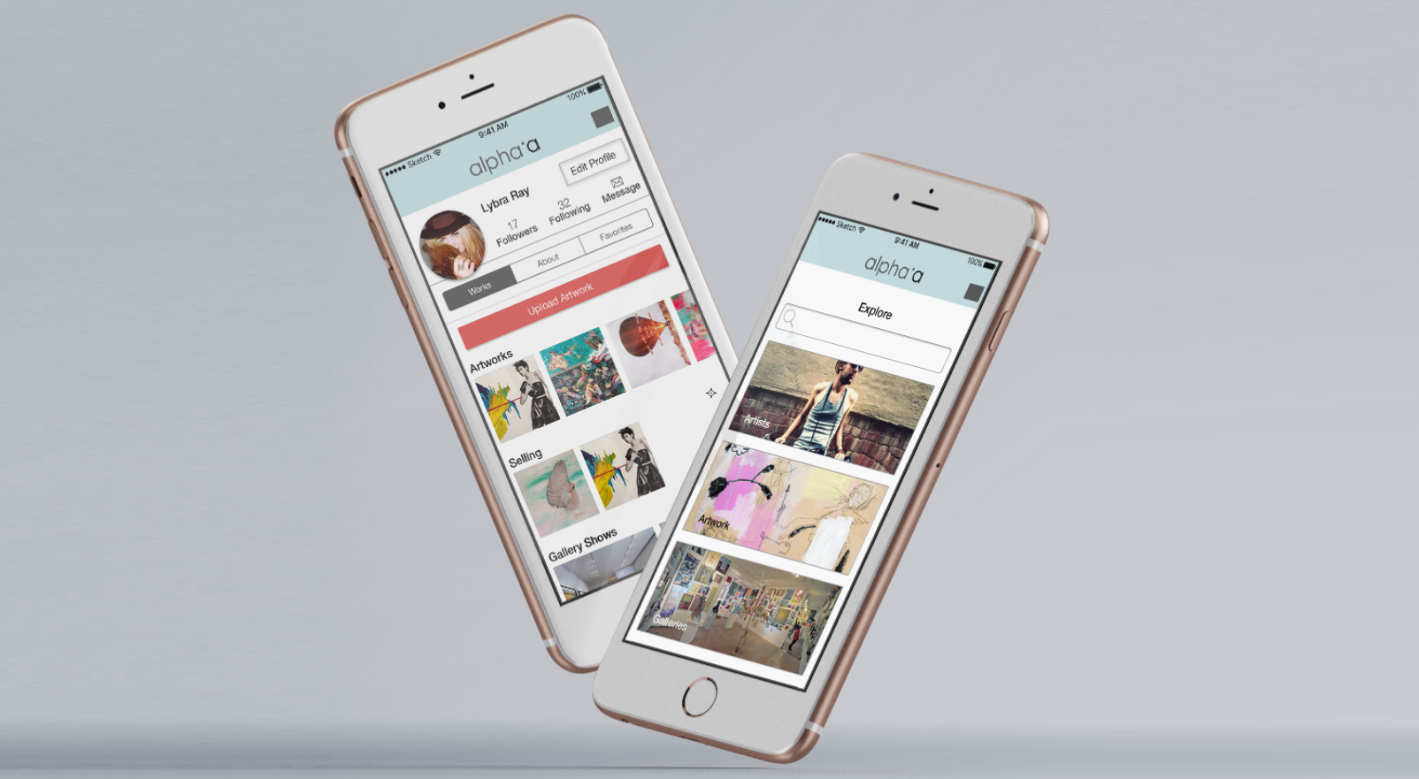
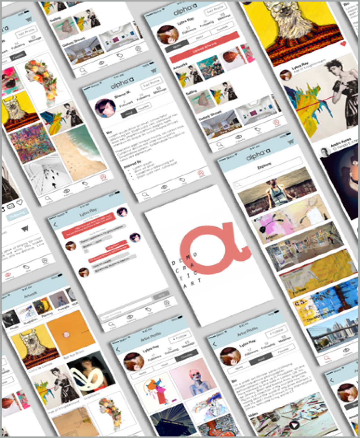
Alpha’a is a brazil based app that connects artists with interior decorators and buyers. My colleague and I worked with the owners to help elevate the experience and streamline the table stakes functionality
After client meetings and being given a brief the problem statement became clear.
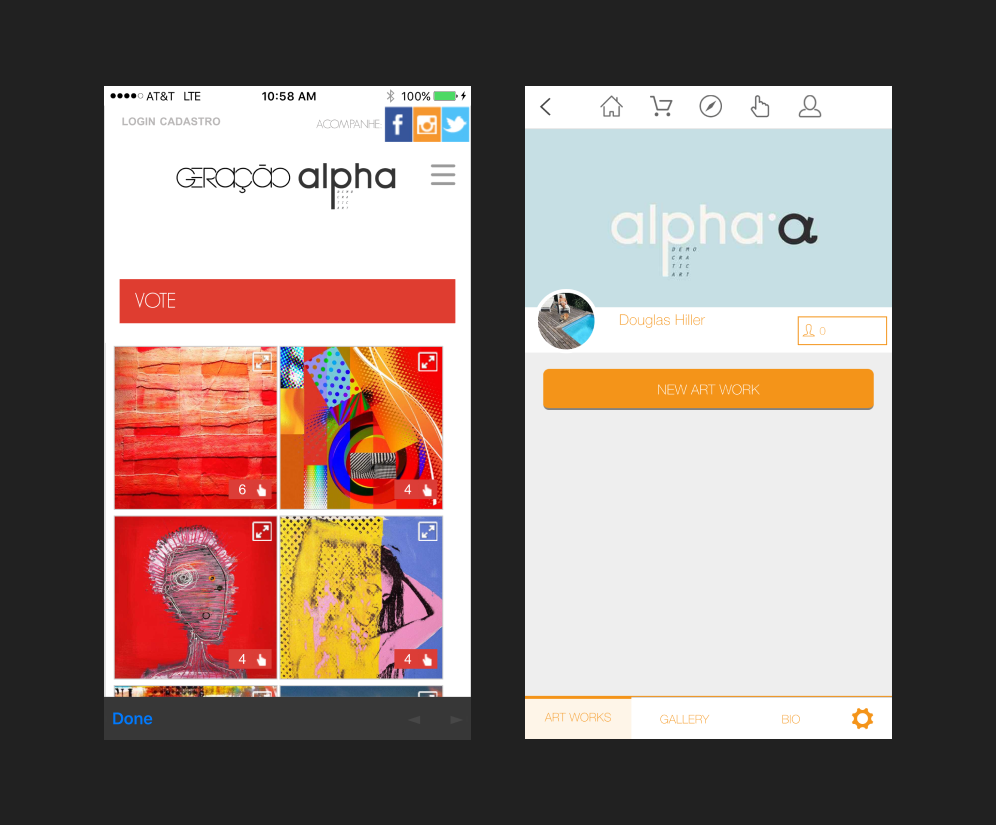
Alpha’a Quote: “App needs to be easy to use and facilitates how an artist shows, organizes and
commercializes his/her work.”
An aim is is create a voting system that allows users to vote their favorite artists in the app.
I observed the current app to identify if high value flows were easy to navigate and table stakes functionalities were met.
Opportunities:
- 100% of users found confusion over the Apps voting function (one of the primary reasons for the app)
- Most expected the ability to purchase art
- There was icon confusion
- Map function was unclear
Competitive evaluation
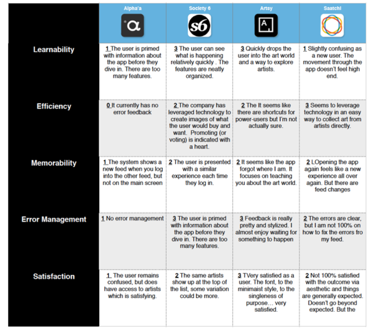
Heuristic Analysis
This technique attempts to measure an app qualitatively within a quantitative space. Tested competitors to see exactly how the current app measures up. I evaluated using a Lemers Heuristic evaluation. Society 6 out performed the others, along with artsy.
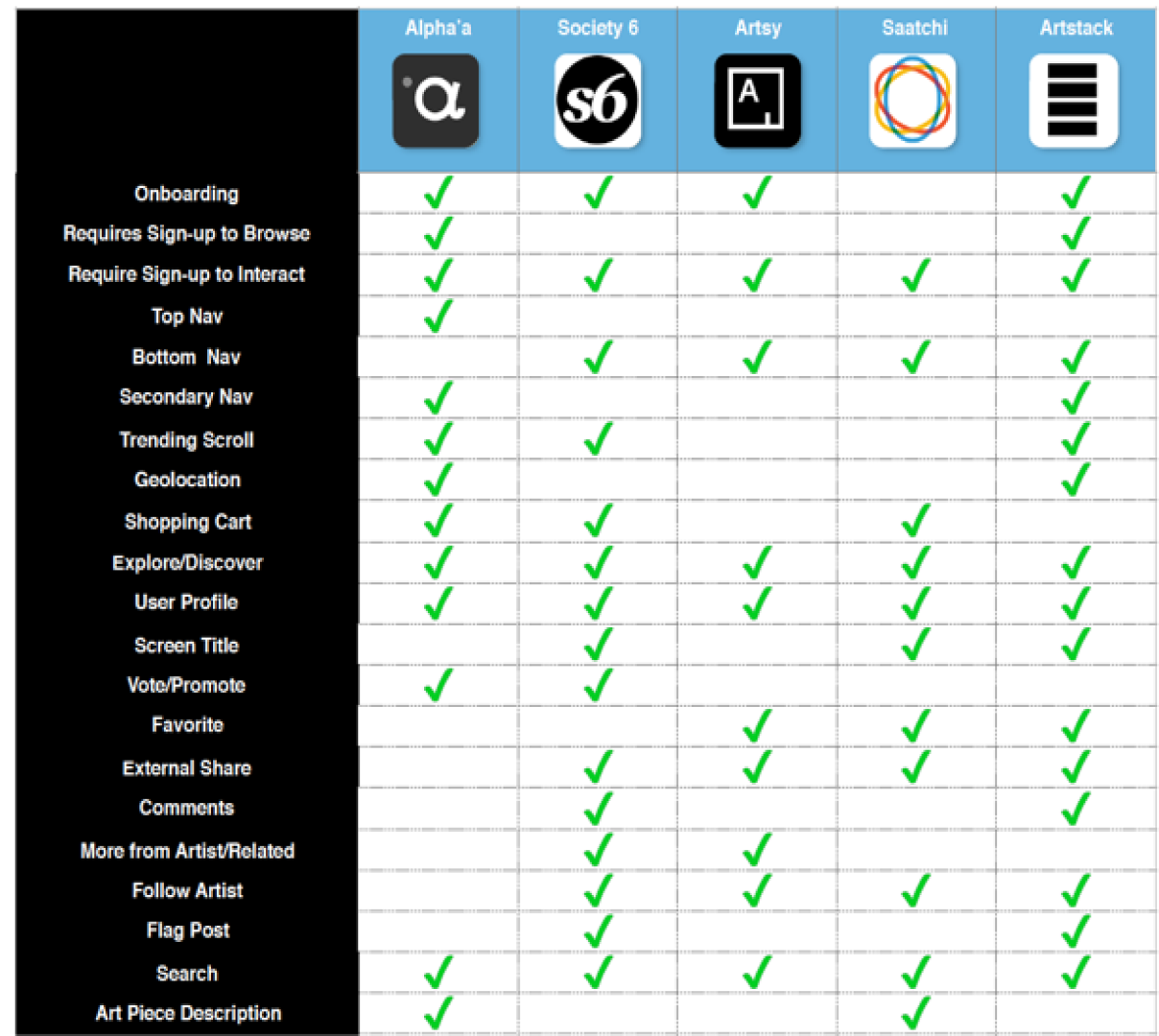
Feature Analysis
Evaluated the features within the competition to pinpoint which features were championed over others.
This also gave an idea of which features might best attack the problem statement and best serve to connect the artist and buyer.
Survey data
40 people responded to a screener created to see how people interacted with the art world and visual apps in general.
75% respondents were art buyers Approximately 80% users reported spending under $250 on art
Majority of users reported some form of exploratory browsing both on and offline
Majority of respondents reported buying art in-person vs. online
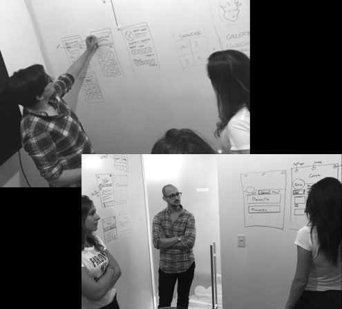
Client Design Studio
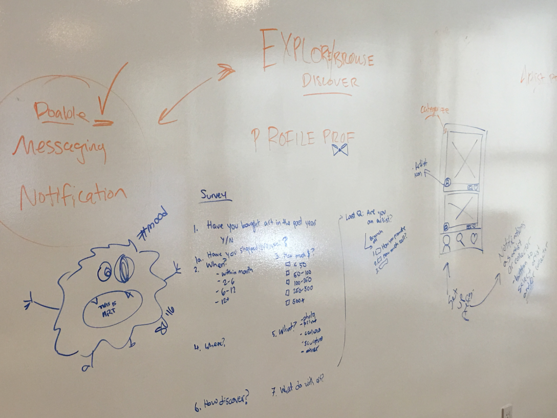
I held a design studio with the clients and a couple team members to help everyone get on the same page regarding how things would look and where apps would be placed.
This brought client and design on the same page which gave a solid jump off of features.
MUSIC ON
8 minutes of open sketching
2 minutes of explaining design
1 minute of critique
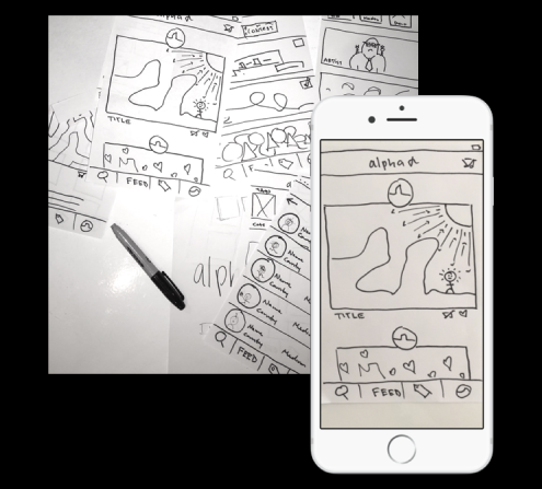
Sketching and POP prototype
From there I dove into sketching a workable, prototypable sketch that would could use to test.
The primary function of this type of prototype is to see how people respond to it without knowing much.
Can you identify purpose of the app? Are the rough indicators clear in the nav bar?
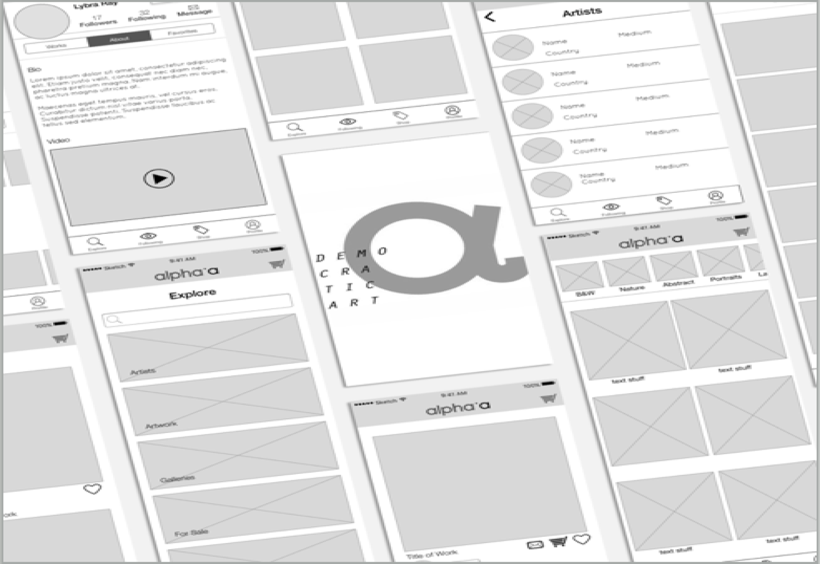
Up the fidelity
I got a rough idea of what was going on and where the problem areas were after the well thought out paper sketches were put together and some anecdotal tests were created
The tested paper prototype bought took the team our designs into digital. Competitive analysis and exploring dribble helped inform design.
Sketching and POP prototype
Developed and tested a hifi prototype to validate the usability. Added animation to the final outcome to communicate the potential delight and personality that could be possible.
Using Principle it became a reality!
It was an enlightening experience working with Alpha’a. I learned most about expectation setting, the importance feature prioritization and the value of high value flow identification.
The app has since been taken down and the business has evolved to a more lucrative structure. The site can be seen here.